SyFy Channel Rebrand
During my second year of university, we were given a live brief. This was to rebrand the American cable channel 'SyFy'. The only aspect of the brand we had to keep was the name. Everything else we had total creative freedom over. We were then tasked to produce a number of different outcomes and present them at the end. I set myself with three key design points that would dictate the entire outcome of all my designs. These points are 1. Bold 2. Emotive 3. Sophisticated
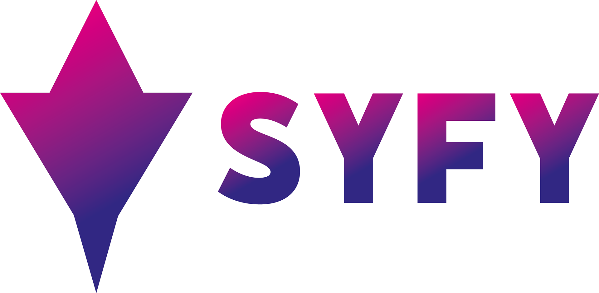
For the logo, I wanted it to look clean and minimal to keep up with today's logo trends yet still keep that sci-fi element. To do this, I used a sans-serif font as my base as its blocky sharpness lends itself well to what I'm trying to achieve. It also works well with the icon that I implemented into the logo itself. Using the 'Y' letter, I turned it into a spaceship silhouette still keeping that 'sci-fi' element that I set for myself at the beginning of this project.


Using Adobe After Effects, I created a transition screen that would be played after each show to inform the viewers of what's upcoming. I chose to design a wavy abstract-like background as it suits the sci-fi aesthetic yet not being too in your face. I needed something that was subtle so as to not draw attention away from the main information. For the colours, I went with dark blue, purple, and pink to represent the galaxy which in turn denotes space. I also created a 'Lower Frame Tune In' animation. It's what plays midway through the program to inform viewers know what's next.
The final outcome that I did was a business card. This ties in all of the previous work and puts it together into one place establishing the overall style of this rebrand. This business card implements the new logo, background design as well as the new brand colours.
